Tuesday, April 8, 2008
My favorite work

This is my favorite work.
I wanted to express vivid negetive and positive spaces
so, I add more on face, cloth, and arm. Therefore, they looks metalic
Labels:
Graphic Design,
Illustrator,
Text as Texture
My Best Work!
Web comic
 I like this web comic because the characters are creative. Most of animal characters are similar to the Walt Disney characters but Gary the Fairy.com makes great new characters.
Also, I like the explanation above the characters.
Labels:
Graphic Design,
Misc. Assignment
My Best Work
 This is my best work so far because I like the symbols I put throughout the song. I also like how it looks old because its called "Hymn". This is one of my favorite songs and I think that the little symbols I put in the middle really help you get the song better. I also made the line "till i only dwell in thee" bigger each time. I just like how simple it is but ultimately has a bigger meaning.
Labels:
Graphic Design,
Illustrator,
Typography
My Best Work
 I think the poem was my best work so far because I think that the shapes and layout of the words really illustrates the images the poem is creating.
Labels:
Graphic Design,
Illustrator,
Typography
Best Assignment So Far

This is my best assignment so far. I think that this one is my best because i didn't use just lines for the shape and texture and value, i used letters. I never thought that I can draw myself like that with a creative way to do it.
Labels:
Graphic Design,
Illustrator,
Text as Texture
Monday, April 7, 2008
Thursday, April 3, 2008
Rams Island
Amazing design and photo links.
These are a bit late but they will blow you away!
www.devonhutchins.com
www.qualiaphoto.com/home/index.htm
www.defgrip.net/v3/autophoto.html
ok maybe not...but i like them a lot.
www.devonhutchins.com
www.qualiaphoto.com/home/index.htm
www.defgrip.net/v3/autophoto.html
ok maybe not...but i like them a lot.
Labels:
Graphic Design,
Misc. Assignment
whitespacers.wordpress.com/
Wednesday, April 2, 2008
Monday, March 31, 2008
Illustration Blog
http://www.karinkuhlmann.de/DigitalWorlds/abstract4/reaction/reaction.html
http://fineartamerica.com/featured/the-huntress-karin-kuhlmann.html
these incredible computer-art are categorized as abstract expressionism.
they are very interesting and as in the second one, you may see
things that are not there from someone else's perspective.
now they might not be considered cartoons, but these pieces of art are
computer-generated designs that really make you think about every aspect of art.
Sunday, March 30, 2008
Illustation Blog
http://flybyfrogblog.blogspot.com/
This artist shows his illustrations which are often inspired and centered around a single word.
This artist shows his illustrations which are often inspired and centered around a single word.
Illustration Blogs
When I was looking for a blog to post on here I found two pretty cool ones...
http://markerbored.blogspot.com/
This first one is a pretty chill blog that I found. The artist does his entire work on a white board. This whole blog is full of pictures of the drawings he has made on a whiteboard. I saw it and just thought it was kind of neat. These drawings aren't just simple doodles, they are the ENTIRE whiteboard. Idk. I really liked it. =)
http://stickysketches.blogspot.com/
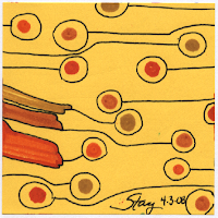
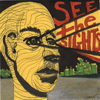
This second one is pretty sweet too. Everything the author draws is on paper the size of sticky note! It is so sweet! Like drawings have so much detail on sucha small piece of paper. All the different sticky notes just seem pretty sweet.. and some of them are really funny. =)

i thought this picture was pretty sweet. Due to the vivid colors used, the multiple drawings withing the art piece, the sense of reality meeting the unreal.
overall i thought this picture
was prett awesome!
THis picture was less realistic though it was made up of mostly real object. i liked the shadowed copy in the background which really brings out the extravagent foreground details.
Illustration blog
Illustration Blog

I like the way this design looks. Its called "Little Planet". Its simple yet there are plenty of things going on. I like it because its cartoony but it also shows what goes on in this fake planet. Its fun to look at.
Labels:
Graphic Design,
Misc. Assignment
Saturday, March 29, 2008
Illustration Blog

http://illustration-design.blogspot.com/
this blog is very interesting. The designs are all really professional and fun to look at.
This picture was my favorite because it shows Steve Jobs made entirely from Apple products.
Thursday, March 27, 2008
My Favorite Illustration & Blog

This company helps other companies' web designing. It is really simple but also cool!
There are many simple and funny comics together.

http://luisices.blogspot.com/2008/03/heavy.html
I like this illustration because the artist uses popart which makes very interest and funny. Also I think that the artist well uses layout. It seems more than one dimension.
My Favorite Illustration Blog
This is my favorite illustration because it gives two different feelings.
The background with the color and the vertical lines gives an urban/city vibe.
The image in the foreground is a tropical looking image and it gives the idea of paradise in the city.
Wednesday, March 26, 2008
Check Out these Illustrations!
Check out the following sites and post specific comments about what you liked best.
Y'all should check Sarah Mensinga's site out, especially the example of model sheets (we will work on this in class next.)
Here is an illustration based on a Bright Eyes song...it has text integrated into the image (what we are working on right now.)
Here is a great example of exaggeration to really make the viewer understand the concept.
Here is a comic that gets published weekly, and sometimes less, sometimes more. It always has great content.
And for all your robot and monster needs check out Vanhoozerstudios.
Please also find your own comic/illustration blogs, and post links to them for others to see.
this font is very 1800 looking.
VERDANA is a font most used by companies.
LUCIDIA GRANDE is a font that is very comic looking

Labels:
Graphic Design,
Misc. Assignment,
Typography
Subscribe to:
Posts (Atom)


.jpg)


