Friday, October 5, 2007

DAIO- Seo-Yoon Kim 2

Seo yoon Kim
Ms. Wieringa
Drawing
Oct. 5.2007

DAIO

I am going to introduce an art piece called Young Woman with a Water Pitcher (1662). The art piece drawn by Johannes Vermeer (1632–1675), was done with Oil on canvas. The art piece has three points of interest which are foreground, middleground, and background. I think the all objects that on the table, covered by red carpet, such as water pitcher and its saucer are the foreground of the work of art. I think the young woman is the middle ground because it looks like it is in between the table and the wall. The last part, the background, is the wall that I mentioned in the middle ground and a yellow tapestry, so detail that I thought this work of art is a photo.

In the Young Woman with a Water Picher, Johannes Vermeer used dark colors, navy and black, to front and back ground in order to show the light is coming from the window. Because of the light that is coming from the window, background had done with bright yellowish color. The details on the yellow tapestry and flower shape texture on the red table carpet are amazingly done. The shading on the young woman’s cloth is another important point to empathize the lines on the cloths. Using bright and dark colors at the same time, Johannes Vermeer made the drawing much vivid and contrast.

Johannes Vermeer was a Dutch. I, therefore, believe that the young woman also a Dutch. When I saw Young Woman with a Water Pitcher, I realized what Johannes Vermeer would like to tell us about. The story is about a Dutch young woman who lives in nunnery. The young woman always depressed when she was looking at the window. Throughout this colorful window, she could felt another beauty of the world that she never felt before. She had been dreamed that she ran away from this horrible prison and flied like the bird that she always saw through the window. She, however, closed the window because she is holding a Water Pitcher. She knew that the beauty she felt was a temptation of the world. She looks sad and depressed, but she is smiling in the love of God.

Trying not to find the art work that is not drawing, I had to skip many art pieces that was came to my attention. Young Woman with a Water Picher was the one of the art piece that I had skipped because at the very first time of searching I strongly believed that this art piece is not a drawing. Because of the details and perfect textures, I thought this art piece is photography. Showing successfully positive and negative spaces by usage of bright and dark colors, Johannes Vermeer made one great art work.

Work Cites

Johannes, Vermeer. Young Woman with a Water Picher. 1662. The Metropolitan Museum of Art. 5 October 2007. < http://www.metmuseum.org/Works_of_Art/viewOne.asp?dep=11&viewmode=0&item=89.15.21 >

Check Out This Artist's Blog!

Go to this blog website for extra credit:

http://sixtyminuteartist.blogspot.com/

You will get extra credit by next week Friday if you read Jerry Lebo's tips on ways to jumpstart your creative process, and how to create art in a small time frame. Then add comments with what you found helpful and what you thought would not work below.

DAIO

Arrielle Dreher
Ms. W
Drawing
5 October 2007
DAIO
Artists are a part of history with their artwork and showing what was going on at that time. One famous arties that is famous of carpeting the history of America was Norman Rockwell. In this picture, called Protcting Sister aperture a part of life of a child. It was done with pencil in the 1950’s.

In this picture, Proctoring Sister, to the right is a young girl with a scared look on her face. She is wearing a white dress and sneaker and is holing on to her bother for safety as it seams. To the left of the little girl is a boy who is a little taller than her. Her is wearing a dark out fit and has on a pair of cowboy boots. His face is looking down and has on a stern look on his face. All the way to the left of the picture now is a dog that is white and has as few black spots and black ears. The dog’s tail is straight up and is staring right at the boy and girl that are to the right of the picture.

In Protecting Sister contains many elements of art. One of them is balance, the boy and girl to the right of the picture balances out the dog in the picture that is all the way to the left. Another elements of art that this picture has is texture, its in the boy and girls hair how it must feel like hair. The boys out fit has the look of how denim will feel. Finally the last elemet of art is value, where the darkness of the boys out fit and the girls dress to the boys cowboys boot has value.

In every picture has a story. In this picture is one about a little girl and her brother playing cowboys and Indians outside. Then a stray dog comes up to the girl and stares to bark. So then the brother hearing the barking comes over and steps in between the dog and his sister to Procter his sister from the dog. The girl holds on to her brother for dear life and for knowing that he will protect her.

I like this piece of artwork. It captures a part of a child life that we all had a moment like is. This artwork is successful because it has the elemetes of art and its different then many of pieces that you will see in an art gallery.


Work Citied
Rockwell, Normen. 1950. Normen Rockwell Musmen. 2007.
http://store.nrm.org/browse.cfm?viewfrom=41&catid=81&step=2

Wednesday, October 3, 2007

DAIO- Seulah Lee


<"Giant," the Giant of Loneliness>
This drawing is a burnished aquatint drawing by the Spanish artist, Francisco de Goya y Lucientes, and is titled Giant. There is a land which is brushed horizontally in the foreground. The giant is sitting on somewhere and his body is huge enough to fit in the middle ground. Goya drew this man as a giant with drawing the moon much smaller than him so that he looks big enough. The background is dark but is gradated from the darkest sky to the light on the bottom.
In this drawing, Goya uses a balance well with using a giant and the ground as a perpendicular. The giant is sitting on the ground vertically and the land is horizontal. There is no exact pattern of lines; however, burnishing is a suitable style for this drawing. The giant's head points out the moon which is tiny and small above of the Giant. Spaces, where the giant is being excepted, are all dark and gloomy and gray. The giant is colored the black but with the gradation and the shade.
This drawing, therefore, represents the human conflict as a depression or loneliness. This might be also the reason why Goya drew this guy as a giant. There is no additional things around him and is simpbolic exptression showing how much he feels lonely.
I like this drawing because it is symbolic and is creative even though it is simple drawing. The back of giant in the middle makes me to feel Goya's idea. The giant who is depressive because of his loneliness that seperates him from the nornmal people. His physical difference makes him to feel a giant emptyness. Becuase of my own imagination about this drawing, the simple drawing of the giant becomes the unique story.
Worked by
Goya, Francisco. Giant. 1818. The Metropolitan Musement of Art, New York. 3 Oct. 2007http://www.metmuseum.org/toah/hd/goya/ho_35.42.htm.
Dan Bruinooge
Mrs. W
Drawing
3 October 2007

At the Concert Européen

Georges-Pierre Seurat, a French impressionist artist that lived from 1859-1891, drew At the Concert Européen from 1886-1888 on paper using Conté crayon and gouache. In this drawing, the point of view is one of a person in the audience of a European concert with the main focus, the foreground, being the singer in the white dress in the corner of the stage. The middle-ground of the drawing is the darker heads of the people in the audience in front of the viewer. The background is the stage.
All of the lines in the picture that outline and define the different shapes and figures are implied by the contrast in value. The brightness and body language of the singer in the foreground makes her stand out more than anything else in the picture. Even though the audience has a great amount of contrast, their stillness makes them not stand out as much as the singer. The background has very little texture or detail, containing few lines and light shading. The plainness of the background makes the singer and audience stand out even more.
I believe Seurat created this drawing to capture a beautiful memory he once had at a concert for two reasons. The first is that the texture throughout the drawing is general and fuzzy which gives me the idea that he did not create the drawing precisely as the concert was taken place; but was instead only worked on afterward as a general and fuzzy memory. The second reason is because of the posture of the people in the audience. Their posture and the way that all their heads are in the same direction gives you a feeling that they are being well entertained and sucked into the incredible beauty of the concert, whereas if they were more slouched with their heads in different directions, it would make the moment seem less sublime.
I think that this is a great drawing. I think this because of how interesting the texture is and how clearly his message came across to me. As I look at the drawing, I can’t help but wonder how exactly he went about making such a unique and aesthetic texture. I like how clear the emotion is to me. I think that that is a key part of making any work of art, that if you can’t relate to a work of art, regardless of how original or interesting it may be, you cannot possibly enjoy it nearly as much as if you can relate to it.

Work Cited

"The Collection." Moma.Org. 3 Oct. 2007 . .

DAIO 10/2

R.S.
Mrs. Wierenga
DAOI
2 October 2007

Flag by: Jasper Johns

Jasper Johns created his work the Flag between the years 1954 and 1955. The picture is created by using encaustic, oil, and collage on fabric mounted on plywood. It is a picture of an american flag. It is layered so it looks thick and you can see layers of newspaper showing throught the top coat of paint. There isnt much of a foreground, middleground, and background because this print isnt a realistic rendition. But you could say that the newspaper is the background, creating depth where the paint is more of the foreground.
It looks like it took a lot of time to finish. They are so many layers and each layer is unique. Its complicated and obviously took a lot of time and planning. It isnt a spir of the moment painting. Johns planned it all out and in the end is came out very nicely.
Johns created the Flag after he had a dream about an american flag. So I think its safe to say that he was inspired to create this piece of art. When I look at this picture I can see the insperation show through. All of his thoughts and feelings are portrayed by the way he created this picture. You feel a vibe of love for his country, but I get the sense that it is much bigger than that. Almost like he is showing his own flag through this one.
Jasper Johns was a brilliant artist. He knew how to work colors and express emotion. I like the way he was so open with most of his works. This piece is a success because I connected with it right away, and to me that is the basic goal of an artist. To be able to speak to people throught your artwork is an amazing talent. The Flag deffinalty inspired me.


works cited:

"Jasper Johns." Wikipedia. 2 Oct. 2007 .

Tuesday, October 2, 2007

La Scapigliata

Hunter 1
Dominique Hunter
Mrs. Wierenga
Drawing
3 October 2007


La Scapigliata

“La Scapigliata” is a drawing by the ever-famous Leonardo da Vinci. It was made in 1508, during the Renaissance period. In this work of art, da Vinci used brown and black oil paints to create a texturized yet simple look. In the foreground of this drawing, is the neck and shoulders of a young woman fades off the page. In the middle ground of this drawing is the face of the young woman. Lastly, the background of this drawing is just brown, faded oil paints.
Contrast is clearly seen here in the different shades of neutral colors (brown, black, white). Da Vinci also emphasizes on the young woman’s face by putting more detail into that than anything else. The use of lines are also used very well in this drawing. The lines add to the detail and emotion of the girl’s face.
Though the young woman’s face may seem solemn at first, she is not all together saddened. She seems to be in deep thought, perhaps thinking about her love. She may also be gazing into the eyes of her unseen child. The woman in the picture very much resembles Mother Mary in that aspect.
This drawing is a very beautiful piece of artwork, as many of da Vinci’s pieces are. Though this drawing is from the Renaissance age and depicts an “old fashion” view of a young woman, it can still be appreciated. I really liked the way in which da Vinci drew this young woman. It is such a simple picture, yet it holds so much emotion and so many possible meanings.

Works Cited

Leonardo da Vinci-La Scapigliata. 2007. Online. 2 Oct 2007.< http://images.google.com/imgres?imgurl=http://www.reproarte.com/files/images/V/vinci_leonardo_da/0146-0310_maedchenkopf_mit_wirrem_haar.jpg&imgrefurl=http://www.reproarte.com/picture/Leonardo%2Bda_Vinci/La%2BScapigliata/12022.html&h=500&w=416&sz=73&hl=en& >.

I forgot this!

Work Cited

Vincent van Gogh (1853-1890), Cafe-Terrace At Night, Kröller-Müller Museum in Otterlo, Netherlands.

Julie Park - "Monet's Painting"

Julie Park

Monet Painting


Monet is above all my favorite artist. His use of color allows landscape seem like a dream. Monet worked primarily in oil paint. I can see Monet used a lot of colors which was a light color, such as white, yellow. also I can see his brushstrokes, which very from thick to thin. he used variety of colors and texture to allow a clear view of the surface of the pond. I love texture of his painting and understand the process he used.

I love Monet's water lily garden. when I see this picture first, I feel peaceful and relax myself and I wonder how he painted this beautiful water pond. This picture reminds me that when I was young I used to have garden in my back yard. I used to go to the pond every weekend with my family. Every time when I look at this picture, I feel happy because reminds my family and my old house.

I love Monet's painting because I am impressed by the passion of Monet's art works. I love his blending of shades of colors, stillness of formless motion. I love the attitude of the artist to come through and make an impression of that attitude on my mind. I think Impressionists made the best impression.

I think Claude Monet is probably the best loved of all the impressionist painters, and he was the most influential. In his final years he was troubled by failing eyesight during, but he painted until the end. I wonder how the cateracts in his eyes effected the way he painted. He is the one whose works inspired me to take interest in painting.


http://images.google.com/imgres?imgurl=http://claude-monet.org/artbase/Monet/1897-1899/w1509/apc.jpg&imgrefurl=http://www.interagir.com/%3FentryID%3D36&h=583&w=600&sz=116&hl=en&start=1&sig2=n24DlsGT8JdnOdTyTiKzVg&um=1&tbnid=OZgHtkxENC9FRM:&tbnh=131&tbnw=135&ei=jQADR8yfCImceICbjPML&prev=/images%3Fq%3DMonet%2527s%2Bwater%2Bpond%26svnum%3D10%26um%3D1%26hl%3Den%26sa%3DN

Art Daio


Ms. Wieringa
Drawing
3 October 2007


Daio: Blue and Green Music


Blue and Green Music is one of many works of art created by Georgia O’Keeffe. This oil painting on canvas, created in 1919 currently resides in the Art Institute of Chicago. Although this painting is quite abstract, many things about it can be interpreted and described. In the foreground, there is brownish green swirls that almost resemble a caterpillar. In the middle ground, there are heavy dark lines. These lines can be predicted as large bars holding the luminous, mystical blue and green smoke that is in the background.
By examining this painting, it is discovered that O’Keeffe used many elements and principles of art to capture the viewer’s attention. Color is one example. The bright blues and greens seem to jump off the canvas and draw the viewer in. One the other hand, contrast and emphasis are used also. Contrast is evident by the bright colors that are surrounded by darker ones. Emphasis is used to draw the viewer’s eye from the dark forms and to the bright colors. Finally, movement is used. Movement allows the viewer’s eye to be instantly grabbed by the bright colors on the bottom of the page and then quickly
follow the “mist” the leads to the top of the canvas.
Since this painting is quite abstract, many ideas can be interpreted from it. The most obvious interpretation comes from the painting’s title, Blue and Green Music. The painting itself seems to follow the melodies and harmonies of a distinct song. Also this painting can be interpreted as may other things. For example, the northern lights many have been an inspiration of O’Keeffe, or perhaps a world that lies far beneath the water’s surface.
This painting, Blue and Green Music, is one of many of O’Keeffe’s glorious works of art that reside in museums around the globe. In my opinion, I really like how abstract the painting is because it allows me to interpret the meaning in my own personal way. Also I like the colors that O’Keeffe chose and how they seem to lead you eye across the page. I believe that this painting could be successful depending on the viewer’s taste in artwork. For example, if the viewer likes abstract works of art, I would highly recommend this painting, but if has a “fine” taste of richness and color, I would not recommend this piece.


Work Cited


"Blue and Green Music." Online Photograph. Encyclopædia Britannica Online. 2 Oct. 2007 < http://search.eb.com/eb/art-60082 >.


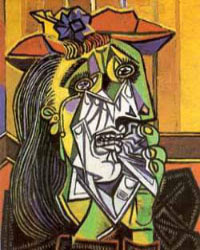
Weeping Woman
Pablo Picasso(1937)
D : This painting has a sharp surface and jagged lines. The handkerchidf woman uses looks like a broken glass. The woman's eyes are really black. and in the middle of an eye, there is a crack. This painting expresses human emotion very strongly by giveing a sharp look.
A: The art term used in this painting the line. Lines are well described. It gives strong impression on the painting. Another term thats is used in this is primary colors. Primary colors are red, yellow, and blue. Picasso uses these colors alot in this painting. Also, secondary colors are used, which is orange, purple, and green. The shapes are sharp.
I : When picasso drew this painting, i think he saw a woman cring because she lost something. Picasso thought that it was really sad, and he tried to depict the expression on the woman. He used may types of techniques to depict the expression on the face of the woman.
o : I don't like this painting personally. Because the mourn looks on the woman's face is not pleasant to me. It's feels like i am in the pain,Very strinking. But this painting is a successful work of art. Because Pablo Picasso depicted the sadness of a woman very strongly that everybody can feel it. This painting is showing how much pain can be communicated by human face. Picasso expressed it very well.

DAIO

A storm in the Rocky Mountains – Mt. Rosalie, is a beautiful portrayal of a storm in the Rocky Mountains. This paining is done by Albert Bierstadt in 1866. Bierstadt was one of the most famous, popular and highly paid landscape painters of the Rocky Mountains. The German artist was exploring the west with other explorers and they made camp, and called it Mt.-Rosalie, named after his future wife. The explorers were on rout from Fort Laramie across the Rockies to the Pacific. This painting is typical of one of Beirstadt’s compositions. The medium that was used was oil and canvas (7 by 12”). In the foreground, we see that looks like burned trees, and rocks and Indians hunting, it is darker in the foreground. In the middleground we see where the sun is shining through the clouds shining on the lake, on the right there is a towering mountain. The background, we see beautiful rolling clouds and a peak from a mountain in the Rocky Mountains, it is brighter in the background and the middleground.

The elements that are you can see in this painting by Albert Bierstadt are line, texture, space, and color. The colors that look like have been used are white, purple, blue, black, tan. Space is taken up beautifully with the big looming cliffs around the lake and the trees in the foreground, and the Indians hunting in the foreground.

In A storm in the Rocky Mountains – Mt. Rosalie, you can see the clouds are all different colors, grey, black, white, dark, light, you can tell that there is a storm coming, and there is still a little bit of light shining through the clouds.

I really like In A storm in the Rocky MountainsMt. Rosalie when I’m looking at this painting I feel like I am calm and peaceful. I think the story behind it is that they artist was on a trip and saw the mountains and painted them, he probably painted the storm because maybe he had a storm raging inside of him

The painting caught my eye because I like drawing mountains, and i thought it was gorgeous how Beirstadt contrasted everything. Looking at it I feel calm and peaceful This painting is very beautiful and makes me feel small. It shows the beautiful things that God did when creating the world, and all the little details that make a magnificent picture.

Works Cited

Beirstadt, Albert. A storm in the Rocky Mountains – Mt. Rosalie. Remington & Russell and the Art of the American West. By Jennings, Kate F. Spain:Brompton Books Corp., 1993. pg. 34-35.


works cited and picture


I forgot this on my daio which is the post right below this.

Works Cited

Van Ruisdael, Jacob, Dune Landscape with Oak Tree. 1650-1655. The Metropolitan Museum

of Art. 2 October 2007. < http://www.metmuseum.org/Works_of_Art/viewOne.asp?dep=9&viewmode=0&isHighlight=1&item=1995%2E196 >.


DAIO

Samantha de Waal Malefyt
Ms. Wierenga
Drawing
3 October 2007

DAIO

This drawing is a black chalk drawing by the Dutch artist, Jacob Van Ruisdael, and is titled Dune Landscape with Oak Tree. In the foreground of the drawing is a river and shrubbery. The middle ground contains a giant tree on a small hill. In the background can be seen more trees, mountains, and even a house. Also in the background, there appears to be stormy skies.


In this drawing, Van Ruisdael creates balance by keeping the right side open and light in order to balance out the darker, more detailed left side. Van Ruisdael uses short, dark lines in the shrubs and the center tree in order to create detail and emphasis in the foreground. It also gives the plants a sharp, leafy texture that makes it seem like they would be rough to the touch, while the river along the right side has a smooth texture making it appear to flow along the paper. Van Ruisdael blends the chalk of the mountain and the sky to make the mountains seem further in the distance and in order to give the appearance of a cloudy day.


This drawing shows a very homey, quaint scene. The house nestled in the background and the plant life by the river makes it seem like a nice, quiet place to live or visit. But the cloudy sky and the fact that the drawing is done in black and white gives the artwork a creepy disturbing feel to it. Even though the tree has some leaves on it, it skeletal branches and structure can still be seen. Van Ruisdael took a warm country scene and gave it a dark edge with his choice of medium and with little details added to the composition.


This drawing immediately caught my eye because of the extreme detail it possesses. I like the drawing because it can appear dark and mysterious to some, and it can also seem like a great scene of nature and the countryside. The work is successful because Van Ruisdael was trying to create an independent, striking, black-and-white drawing. It is defiantly a piece that can stand on its and capture your attention.

DAIO


This is a famous painting by Vincent Van Gogh, called Starry Night. In June of 1889, Van Gogh painted Starry Night with oils on canvas. In the foreground is a large fire that set closer to the viewer to show emphasis. The middle ground includes a small town in the country. Lastly the background includes a beautiful night sky, with glowing stars, which is the main focus.

Van Gogh uses a lot of elements in this painting. The element of line is apparent when you look at the sky around the stars and the moon. Another element of art that Van Gogh used in this painting would be space. Even though his main focus is the night sky, he still makes the town and the fire noticeable. The last element that is apparent in Starry Night is the element of texture. Van Gogh used different brush strokes to create the texture of the sky, fire, and the city.

Not only did Van Gogh use different elements of art he also used principles of design in this painting. One main principle would be the principle of movement. The movement with the stars shows the beauty of the night. His painting is also very balanced, the fire and the moon are placed well so that your eyes wander throughout the whole picture. Lastly he uses harmony and unity through the colors and the textures.

Van Gogh painted Starry Night when he was in an asylum, where he produced over a hundred other paintings. Van Gogh loved the night time because it was so promising and colorful. He wanted people to stop in there busy day and glance up at the stars and moon at night and see their beauty.

I love this painting, his use of color and texture go great together. This is a very successful piece of art because it does make you appreciate what God has given us even in the night time. This is one of Van Gogh’s most famous painting and is on display in the MoMA.


Works Cited


Van Gogh, Vincent. “Starry Night.” MoMa.org. The Museum of Modern Art. 1889. 18 December 2006. 2006.

DAIO - Cindy Baik

Cindy Baik


Ms. Wieringa


Drawing


Oct.2.2007


DAIO


I am goint to introduce one of my favorite painting, Cafe-Terrace At Night (1888)by Vincent van Gogh, who was a famous Dutch artist and the most great Post Impressionist painter. The painting was hand-painted with oil on canvas. There is a night scene in the painting and the stars are depicted by very bright color of yellow. Also, that light effects of the night. We can easily see that Van Gogh has achieved an effect of luminosity with the use of contrasting colors and tones. In the painting, the darks compliment the lights, the blues intensify the oranges, and the purples bring out the yellows. The painting is not symmetrical, but Van Gogh expressed the perspective by drawing things big which is close to him, and drawing small which is far from him. So in the painting we can surely see that there is a cafe-terrace following on the side street.


In Cafe-Terrace At Night, t
here are some people on the terrace in the bright lamplight, and also can see a couple who are walking forward to the cafe together. I think, Van Gogh was trying to say about his loneliness. Looking at the people in the cafe, probably Van Gogh, who was painting the picture on the side road by himself must be lonely. He undoubtedly was thinking about his sister and about his solitude.


In the painting, Van Gogh painted a night painting without black, with nothing but beautiful blue and violet and green and in this surrounding the illuminated area colors itself sulfur pale yellow and citron green. Those colors are not very related, but they are contrasted by each other. I think it is much beautiful because of that contrasting. He aslo painted by oil, not by other usual paints. So it made a painting much realistic by expressing of the sight of night.


When I first heard about this project, Vincent van Gogh was in my mind. I don't know it was because he was one of the most popular artists out of very few ones to me, or not. Anyway, I looked for things about his paintings. Then, eventually, I picked Cafe-Terrace At Night, because it attracted me at the first sight and I have thought about this painting that it was a very nice before. After searching this painting, I knew that using oil, even though it needs very hard work, if I use good colors, I can express more than what I expected. So in my personal opinion, I think this painting is very special.


Monday, October 1, 2007

DAIO-SIEUN LIM

Sieun Lim
Ms. Wieringa
Drawing
29 September 2007


So Simple, but So Strong

This is my favorite drawing entitled What happened to us? by a modern artist, Dan Perjovschi(Romanian, b. 1961). It was drawn on the museum wall by Perjovschi in 2007. This artwork just have two points of interest, the foreground and back ground. The foreground is composed of lots of scribbling drawings that look like done by a kid, and the background is just blank space which is the white wall in the museum. Although the drawing would look very messy, it also looks funny and interesting.

The drawing was just drawn only with a black permenant maker, and except the line and shape, there is no special elements of art like colors, space, texture, and value. However, despite of its simplicity, the drawing attracts its audience very strongly. If it were just a normal drawing on paper, it would not be well-known by many people as it is now. However, because of the artist's ability to use the space for his art, every single drawing on the wall can be found easily by visitors at the museum with its huge size. Not only the size, but also the strong ideas and messages from Perjovschi's work enchant its viewrs. Since he drew simply, it helps the audience to understand his points directly and makes them interesting with various issues from each drawing. In his artwork, Dan Perjovschi satirizes things that have happened and that are happening to the United States, so most pictures look sarcastic and fun although they are so simple. For example, there is a drawing that criticizes self-interest. It shows two smiling people hugging each other, and one of them put his hand in the other one’s pocket and tries to steal something from him. Another picture also shows prejudice of people. There are people having same bubbles above their heads, but only one person among them has a different shaped bubble as only his face is reddened. This shows how the society forces people to think in same way and isolate those who have different concepts. Lastly, there is a drawing of three cars that represents that the wealth of men is judged by the size of their cars and satirizes the materialism. Dan Perjovschi does not onlydeal with these topics, but also talks with various other topics and points out problems from them, such as environmental pollution, the Iraq war, isolation of arts from the public, nationalism, and so on. The stories in the drawing are still happening now, so it attracts its audience strongly because it is what is in the new now and makes them think carefully about those issues again.

I love this drawing byDan Perjovschi because his art style is similar to mine. When I work on my artwork, I am mostly concerned with how to communicate my idea and messages to the audience effectively through my art rather than how to use techniques well to make the subject more realistic. Although Dan’s simple drawing could be ignorant to some people, it successfully communicated his messages to the audience. He knows the way that makes his works more attractive and effective as my art teacher said," if he drew these pictures on a normal size paper like most artists do, his drawing would not be very great as it is now." The other reason I like his drawing is that the stories seem to happen in not only America but everyplace around me. I was really touched by the messages he gave. I hope this great work influences many people’s thoughts and leads them to make some changes for a better world.


Work Cited

Perjovschi, Dan. WHAT HAPPENED TO US?. 27 August 2007. Museum of Modern Art, New York.30 September2007. <http://www.moma.org/exhibitions/exhibitions.php?id=3956>.


Sunday, September 30, 2007

DAIO- Seo-Yoon Kim

Seo yoon Kim
Ms. Wieringa
Drawing
Oct.1.2007

DAIO

I am going to introduce an art piece called The Storm (1922). The art piece drawn by Georgia O’Keeffe (1887~1986), was done with pastel on paper, mounted on illustration board. The art piece has three points of interest which are foreground, middleground, and background. I think the two white quarters of circular shapes with one yellow circle are the foreground because they looklike the most forward objects in the work of art. I think the dark blue part with a little bit of yellow color is the middle ground because it looks like it is in between the two white quarters of circular shapes and the black part with the cup shape. The cup shape seems to be brittle, on the center of it’s body because of the fractured lines. The last part, the background, is the black part with the cup shape that I am mentioning in the middleground. Using the color, black, at the background, Georgia O’Keeffe made the cup shape seems to be far away from viewer’s eyes.

In The Storm, Georgia O’Keeffe used bright colors such as white and yellow at the foreground. Then she made the other parts all dark colors to divide the positive and negative space. The two white quarters of circular shapes are not symmetrically harmonious. The important point, however, is not whether the shapes are symmetrical or not. By being unsymmetrical, they seem to vanish, and this is the result of the blending of pastels because the color on the edge of the two white quarters of circular shapes is a new color and has a soft feeling. If they were both symmetrical with no color mixing, the art piece would be sharp and even boring
Because the title is called The Storm, I believe that the story of this work of art related to the weather. Once upon a time, the world had only bright peaceful morning. Among the peaceful world, the leader called the Sun, controlled darkness. He was very strong so that nothing dared attempt to look over his absolute power. The rebellion, “The Strom,” however, occurred at the highest place of the world which was the sky. It brought a strong electrical force, a lightning bolt, to take over the world. The bright force under the Sun fought back, but the lightning bolt was too strong that even the absolute power could not cease it. Eventually, the Sun failed to protect his region and ran away with his brightness.

When I was researching the art pieces for my DAIO, The Storm came to my attention during the very first time of searching. The reason that I could choose it easily was the work of art has lots of ideas. The one factor that I like most about this work of art is showing darkness and brightness at the same time. Although this art piece is a pastel drawing, the detail at the center of the art piece impressed me. Moreover, I always thought that pastel drawing doesn’t have a detail, but now I can see the magic of art. I, therefore, think this work of art is successful.

Work Cites
O'Keeffe, Georgia. The Storm. 1922. The Metropolitan Museum of Art. 29 September
2007. < http://www.metmuseum.org/Works_of_Art/artworks.asp?ReplicationId={6205971C-19F0-45A7-87AB-A1402DF79E0D} >