 This font is the best font I choose. It is San Serif. It is simple and metallic because of interesting negative spaces. The word harmony is not that great because of the number 4 and space between DJ and 4, the style of the font is very interesting.
 This is Decorative font. It is interesting to me because three fonts are mixed. The word, “Storm” is San Serif with Serif because of the letter O. Moreover, the bottom part, “PARANORMAL INVESTICATIONS” it is San Serif with interesting negative spaces.
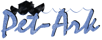
This font is Script because it looks like handwriting. I thought the letters are interesting because they look three dimensions, and like Serif, they have tales.
 This font is Sans Serif. Unlike Serif font, Sans Serif font dose not have dips or tales. Interesting on this font is the negative spaces in the letter P, O, and R.
This font is Serif with Sans serif because “m” and “Ireland” has dips or tales. Interesting on this font is the m and I. They both are bigger than other letters in order to be empathized.

4 comments:
Do you think all of your fonts are successful or well done?
The "Magic of Ireland" font is very well done, because it uses serif letters, sans-serif letters, and decorative to make it look like celtic letters. The use of three different types of lettering flows together nicely.
they are all cool. i want to use one.
i like sans serif the most. its cool
Post a Comment